We asked Michael Khripin, Product Owner at Balancy, to spend time inside Color Block Jam Puzzle and share his early observations from the player experience.
After completing roughly 50 levels, several sessions have passed, most core features are unlocked, and the early retention funnel has had time to work. This makes it a useful point to evaluate not only the gameplay, but also the surrounding UX design, monetization systems, and LiveOps structure.
Here are some observations from the early game experience.
First Launch: Notification Prompt Before Gameplay
The very first screen players encounter is a request to enable push notifications.
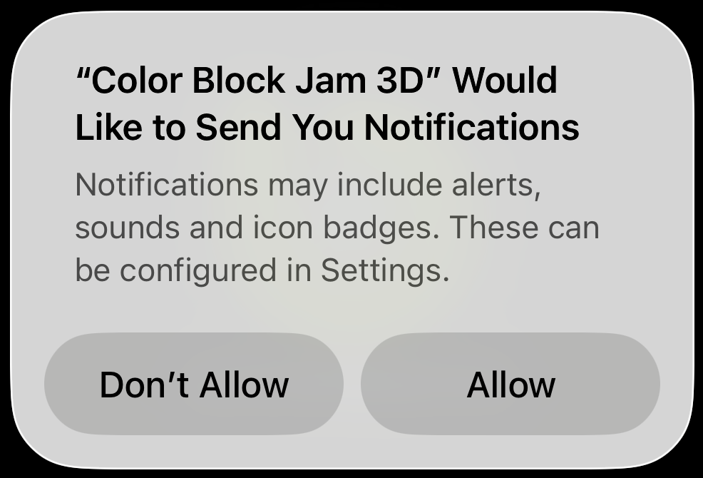
From a UX perspective, this timing can be challenging. At this point, players have not yet experienced the game or developed a reason to return later. Without that context, the request often relies on players tapping through automatically rather than making an informed decision.
Many games instead delay the notification prompt until players have completed several sessions and understand the value of returning to the game.
💡 A note from Michael:
“Push notifications are a powerful retention tool — but timing is everything. When players see the value first, the opt-in rate is usually much higher.”
Localization and First Impressions
The Privacy Policy and Terms of Service screen reveals another detail that affects first impressions: the text capitalization.

Every word begins with a capital letter, which immediately signals that localization may not have received careful editorial attention. Small details like this can subtly influence how polished a product feels, even before gameplay begins.
Localization quality is often an underestimated part of the early player experience.
Level Completion Screen: Reward Communication
After finishing the first level, the game introduces a progress indicator showing how close the player is to unlocking the next feature. This is a strong design choice that builds anticipation and curiosity.
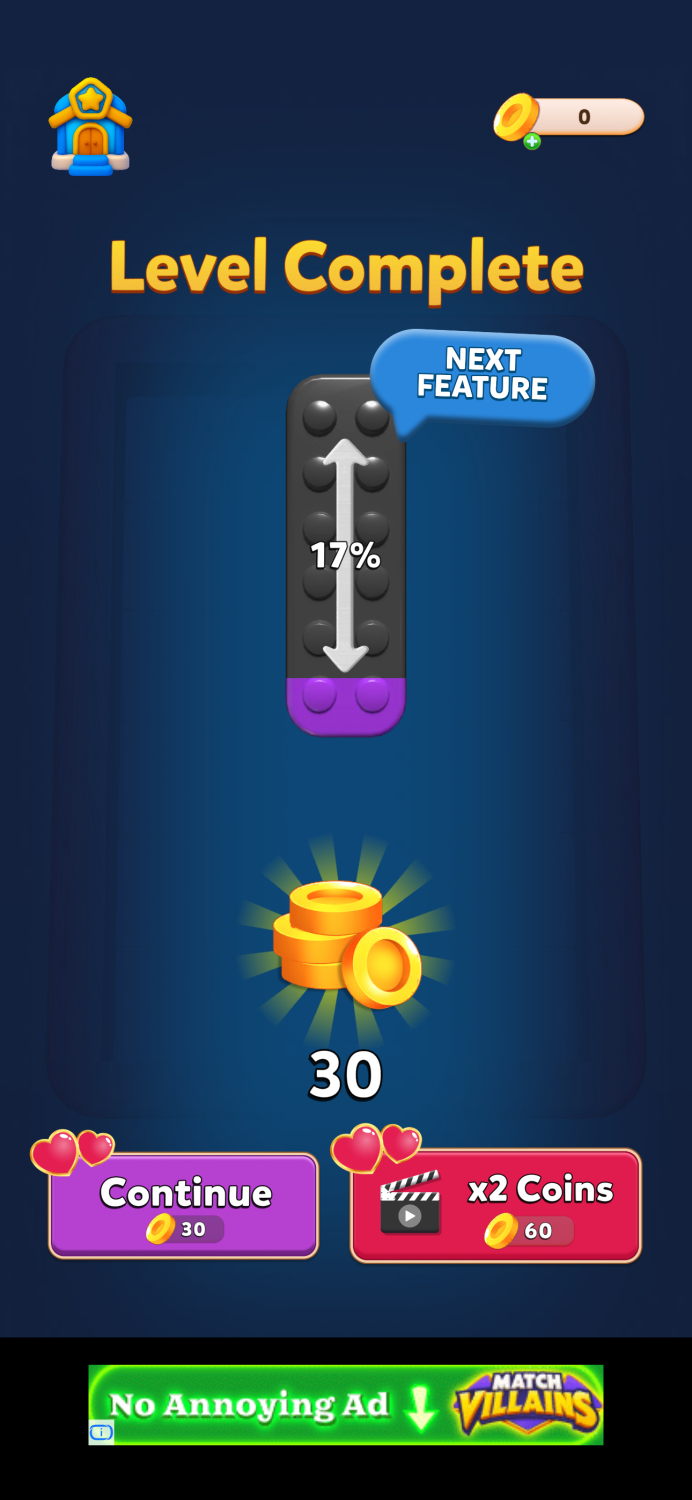
However, the reward buttons on the screen may cause brief confusion.
The buttons resemble purchase buttons with prices, while in reality they are reward collection options. Because price-styled buttons are commonly associated with spending currency, players may momentarily interpret them as costs rather than rewards.
In many puzzle games, reward multipliers are presented through:
-
separate “double reward” buttons
-
spinner mechanics
-
short mini-games that determine the multiplier
These approaches help reinforce the feeling that the reward is earned, rather than simply presented.
💡 A note from Michael:
“When players see a price-style button, their brain assumes spending. If the button actually gives rewards, that moment of confusion breaks the reward loop.”
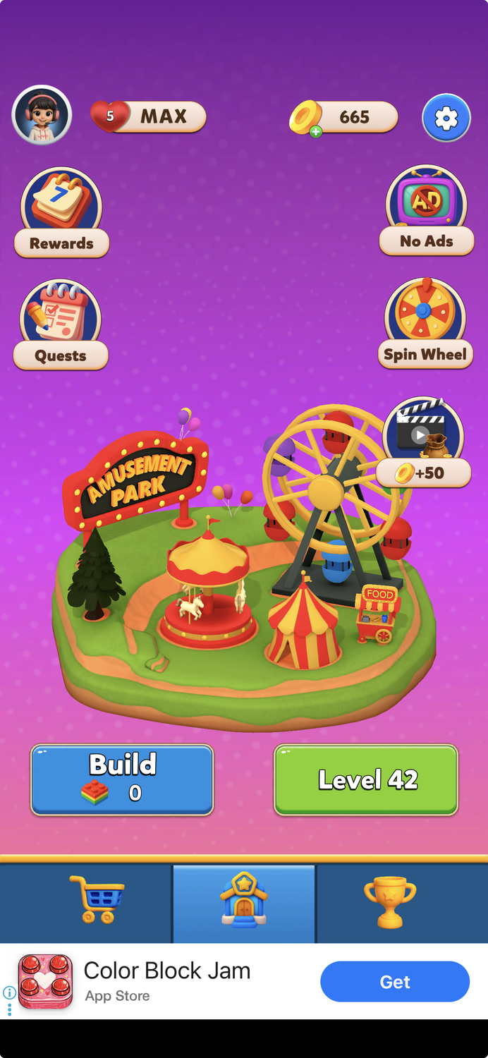
Feature Gating on the Main Screen
The main screen introduces several mechanics that unlock at different player levels.
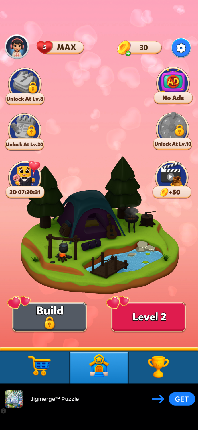
Feature gating is a common way to structure early progression and signal that more content is coming. In this case, players see multiple features scheduled to unlock within the first 30 levels, which naturally creates curiosity.
However, the presentation is not fully consistent:
-
Some locked features show both a padlock and the required level
-
Others show only a padlock
-
The leaderboard reveals its level requirement only after the player taps into it
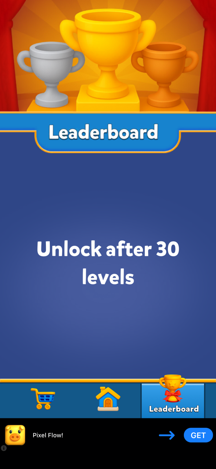
UI systems tend to work best when they follow clear and predictable rules across all elements.
Early Offers and Monetization Signals
Several monetization elements appear on the main screen early in the experience:
-
an ad removal offer
-
a Valentine’s Day bundle
-
a watch-an-ad reward for coins
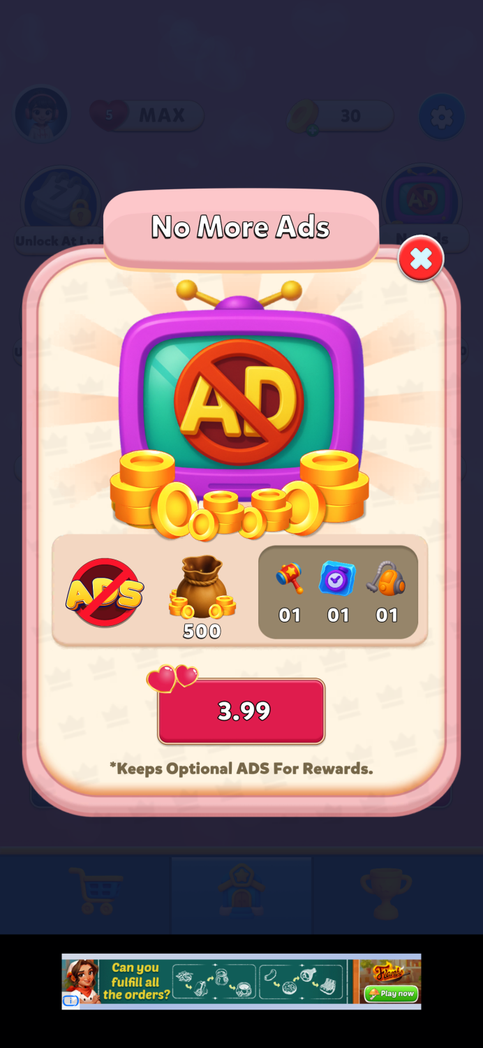
Showing offers early is common in puzzle games, but placement plays an important role.
One interesting choice here is that the rewarded ad coin option appears on the main screen instead of inside the shop. In many games, this mechanic lives inside the shop interface, encouraging players to open the store regularly and reinforcing monetization habits.
Another noticeable detail is inconsistent number formatting across the interface.
Examples include:
-
quantities displayed as “01” instead of “1”
-
bundles using “X5” formatting
Individually these details are small, but collectively they can affect the perceived polish of the UI.
Seasonal Bundle Presentation
The Valentine’s Day bundle uses a familiar structure: a multi-offer bundle with the option to purchase everything at once at a discounted price.
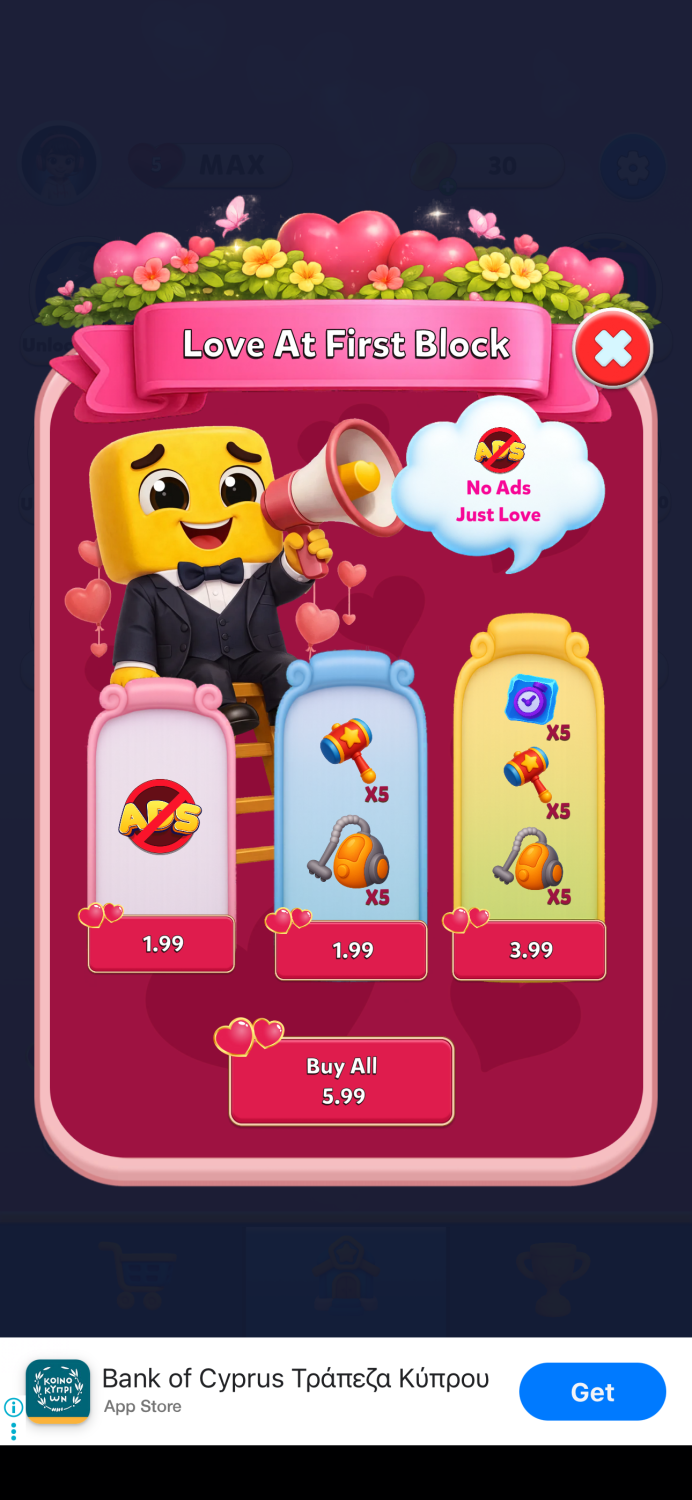
This is a proven mechanic in puzzle monetization systems.
However, several small details weaken the presentation:
-
quantity formatting differs from other parts of the UI
-
purchase buttons appear in red
-
the offer timer visible on the main screen is not shown inside the bundle screen
-
the discount value is not clearly highlighted
Elements such as badges, timers, and visual value indicators often play a key role in helping players understand the value of an offer quickly.
💡 A note from Michael:
“Badges are small elements with huge impact. When they’re placed correctly, they guide player attention and shape the purchase decision.”
The Shop: Solid Foundations with Room to Improve
The in-game shop has both strengths and opportunities for improvement.
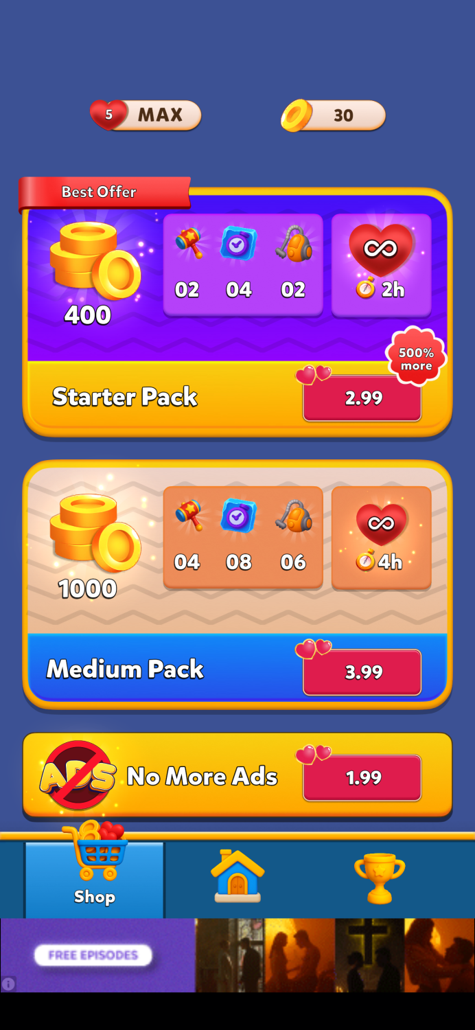
One positive aspect is the currency pack progression. Value increases consistently from smaller packs to larger ones, which avoids arbitrage gaps and keeps pricing logic straightforward.
However, the way offers are highlighted could be improved.
For example:
-
A “60% more” badge appears on a mid-tier pack rather than the pack with the best value.
-
A “500% more” label on the Starter Pack may appear aggressive compared to the actual value delivered.
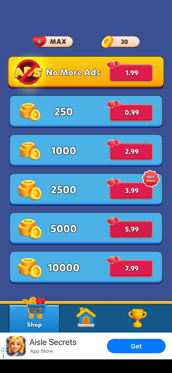
Badges are powerful visual guides in a shop. When placed carefully, they help direct attention toward the intended purchase path.
💡 A note from Michael:
“A misplaced badge can be almost as harmful as having no badge at all — it redirects attention away from the pack you actually want players to buy.”
Building Shop Habits
Another missing element is the integration of daily rewards inside the shop interface.
Many successful puzzle games embed features such as:
-
free daily rewards
-
rewarded ads
-
time-limited bonuses
directly inside the store. These mechanics encourage players to open the shop regularly, which naturally supports monetization engagement.
In Color Block Jam Puzzle, these reward mechanics exist — but they are located outside the shop, creating a more fragmented experience.
UI Consistency Across Screens
Across several screens — including the player profile, level interface, and booster system — UI elements follow slightly different rules.
Examples include:
-
varying capitalization styles
-
inconsistent padlock icons
-
different number formatting
-
varying button behavior
None of these elements are critical on their own, but together they create the impression that UI consistency was not fully finalized before release.
Consistency is one of the key factors that contributes to a feeling of polish.
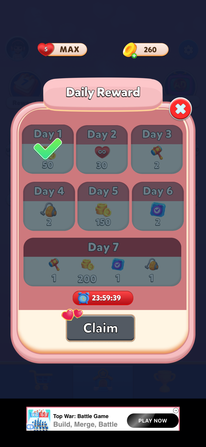
Daily Rewards and Timing
The Daily Reward system operates on a 24-hour cooldown rather than resetting at a specific time each day.
This approach allows players to shift their reward collection time gradually — which can eventually move the reward window into less convenient hours.
Some games prefer a fixed daily reset because it reinforces predictable player routines.
Lucky Spin Visibility
The Lucky Spin mechanic has a four-hour cooldown.
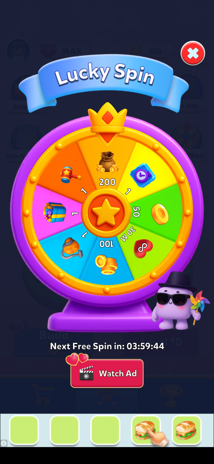
However, the main screen does not clearly signal when a free spin becomes available again. Since the wheel remains accessible through ad watches, the icon appears permanently active.
A small visual indicator when a free spin is available could help improve visibility and engagement.
Seasonal UI and Button Color
One detail becomes clearer later: the red buttons seen earlier were part of the Valentine’s Day theme.
After the event ended, the buttons returned to their standard green color.
Seasonal UI themes can be effective, but primary action buttons often benefit from maintaining consistent color signals. In many interfaces, red is associated with warnings or cancellation, which can unintentionally conflict with purchase actions.
Seasonal decoration is usually most effective when it enhances the interface without altering its core signals.
Final Thoughts
At its core, Color Block Jam Puzzle delivers a solid gameplay experience.
The puzzle design is engaging, the difficulty curve feels balanced, and the core mechanics clearly received careful attention.
However, several surrounding systems — particularly UI consistency, offer presentation, and reward placement — could benefit from additional polish.
Most of the improvements discussed here are relatively straightforward:
• strengthening UI consistency
• clarifying reward presentation
• improving shop habit loops
• refining offer messaging
Small refinements in these areas could significantly improve the overall experience without changing the gameplay itself.
LiveOps Takeaway
Small UX details compound quickly in live service games.
When monetization surfaces, reward loops, and UI signals are aligned, players navigate the game economy naturally — which improves both engagement and conversion.
Platforms like Balancy help teams iterate on these systems faster by allowing product and monetization teams to:
• experiment with offers and bundles
• test UI layouts and reward logic
• run A/B tests on shop structures and LiveOps events
• adjust configurations without waiting for client updates
For teams operating live games, the ability to iterate quickly and safely is often what turns good monetization systems into great ones.
To see this approach in practice, we recreated a Valentine’s-themed LiveOps offer inspired by the mobile game Love & Pies and built it step-by-step using Balancy.
🎥 Watch the short walkthrough below to see how a LiveOps offer can be designed, configured, and tested in minutes.