We asked Michael Khripin, Product Owner at Balancy and author of the book Best Practices for In-Game Shops, to analyze the in-game stores of five top-performing mobile titles. Each one takes a different approach to structuring its monetization, and each offers something worth learning.
In this article, we’ll explore which shop design patterns make spending intuitive and rewarding, and where even successful games leave value on the table.
Dice Dreams – SuperPlay
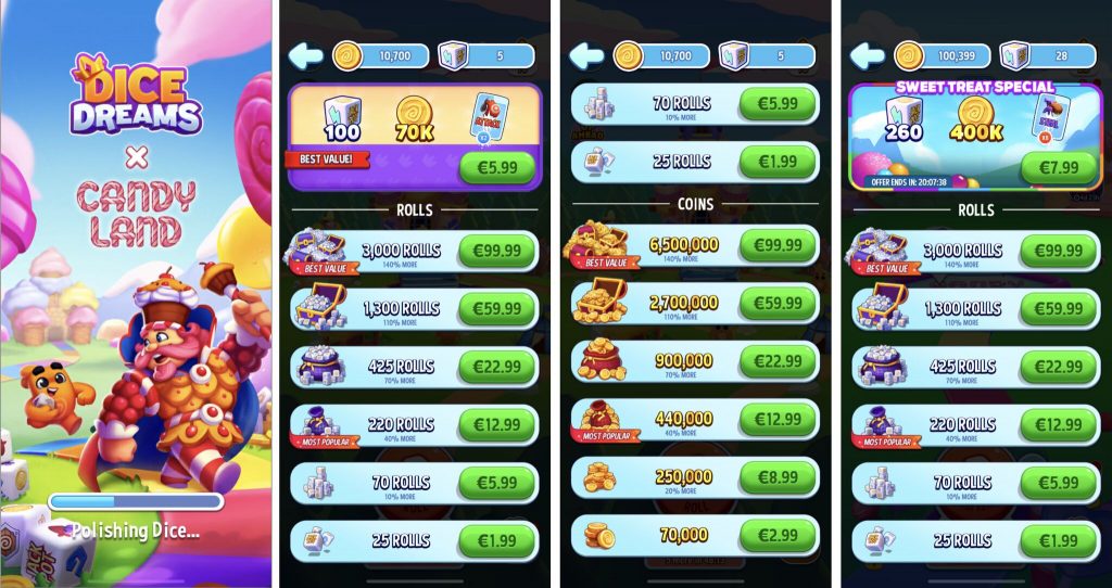
Dice Dreams is confident—and it shows. Their shop design puts big spenders front and center, signaling who this economy is built for.
Data about downloads and IAP revenue of Dice Dreams by SuperPlay in AppMagic (July 2025).
Note that the platform doesn’t provide ad revenue data.
What works:
- Bundles get top billing, clearly prioritized over resource packs.
- “Best Value” and “Most Popular” labels subtly guide purchasing decisions—toward bigger checkouts and social proof.
- Pack sorting: high to low, bold and unapologetic.
- Time-limited event bundles inject urgency, tying monetization to gameplay moments.
- Consistent pricing tiers across resource types create a familiar, navigable shop structure.
- Value progression is visualized—each bigger pack feels like a smarter deal.
💡 A note from Michael:
“I always look for how games teach players to shop. Dice Dreams teaches assertively—big numbers first, no hesitation.”
What could be improved:
- The extra value label (“40% more”) lacks context—more than what?
- Bundles don’t highlight a main item, missing an anchor for player attention.
- UI inconsistencies (e.g. coin vs. rolls pack visuals) make the shop feel a bit patchy.
- Exit button placement breaks expectation—top-left, instead of the familiar top-right X.
- The event bundle title overlaps with its contents, suggesting rushed design.
Royal Match – Dream Games
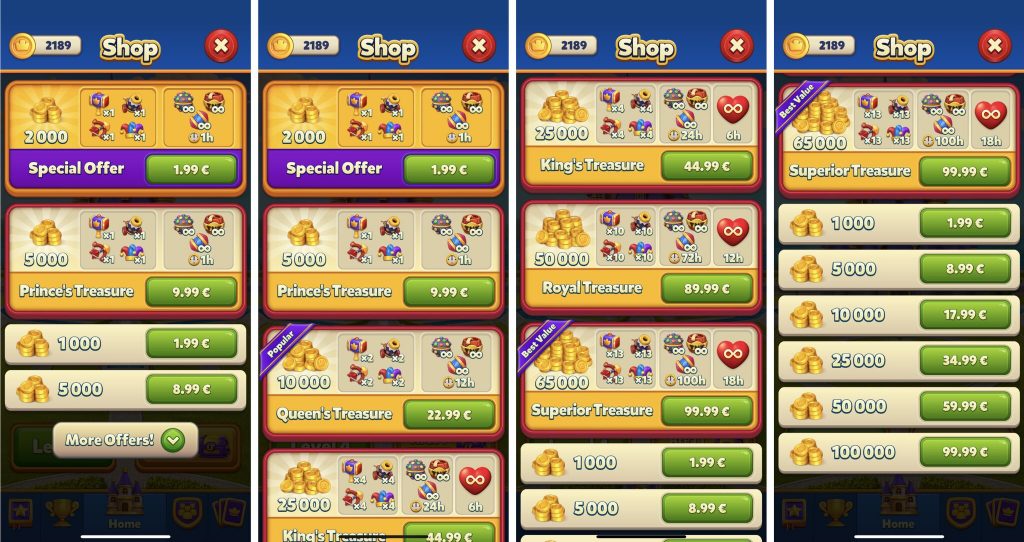
Royal Match opts for simplicity and a soft touch—catering to casual spenders with a clean, approachable layout.
Data about downloads and IAP revenue of Royal Match by Dream Games in AppMagic (July 2025). Note that the platform doesn’t provide ad revenue data.
What works:
- Mini-shop appears first, gently easing new players into the monetization flow.
- Bundles take priority and are clearly marked “Best Value” or “Popular.”
- Sorting is from low to high, signaling inclusivity.
- Animations highlight main items, making the offer easy to parse.
- No fluff—just the facts, compact and clear.
💡 A note from Michael:
“The mini-shop idea is brilliant. It’s cozy, welcoming, and perfectly scoped for first-timers.”
What could be improved:
- No $5 price tier—jumps straight from $2 to $10+.
- No shop sections or tabs—not needed here, but could help if complexity grows.
- Bundle variety is low—essentially one bundle scaled up across slots.
- Visual hierarchy is flat—everything is bright, with few focal points.
- Tight spacing makes bundles feel cramped and harder to read.
Royal Kingdom – Dream Games
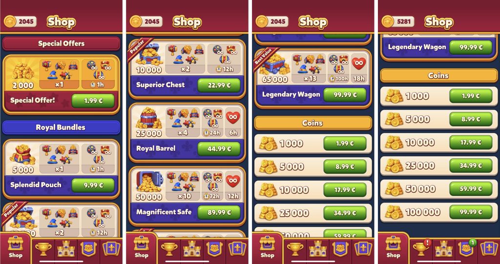
Royal Kingdom builds on Royal Match’s foundation—retaining much of its DNA while tweaking structure and navigation.
 Data about downloads and IAP revenue of Royal Kingdom by Dream Games in AppMagic (July 2025). Note that the platform doesn’t provide ad revenue data.
What works:
- Sections are clearly labeled—offers and bundles are now distinct.
- Exit through swiping replaces the classic close button—seamless integration with bottom navigation.
- Casual-friendly sorting remains intact, low to high.
- Main bundle item is highlighted, helping players focus.
- “Popular” and “Best Value” labels still guide spending.
What could be improved:
- No mini-shop, making the full store feel more intense.
- Same pricing gap ($2 → $10), potentially missing mid-spender conversion.
- Cramped UI and bundle uniformity persist.
- No volume discounts for coins, making them feel less compelling.
💡 A note from Michael:
“Royal Kingdom feels like a sibling to Royal Match—similar DNA, but slightly more grown-up in structure.”
UNO! – Mattel, Inc.
UNO!’s shop is ambitious, packed with features and personalization—but at times, bordering on overwhelming.
 Data about downloads and IAP revenue of UNO! by Mattel, Inc. in AppMagic (July 2025). Note that the platform doesn’t provide ad revenue data.
What works:
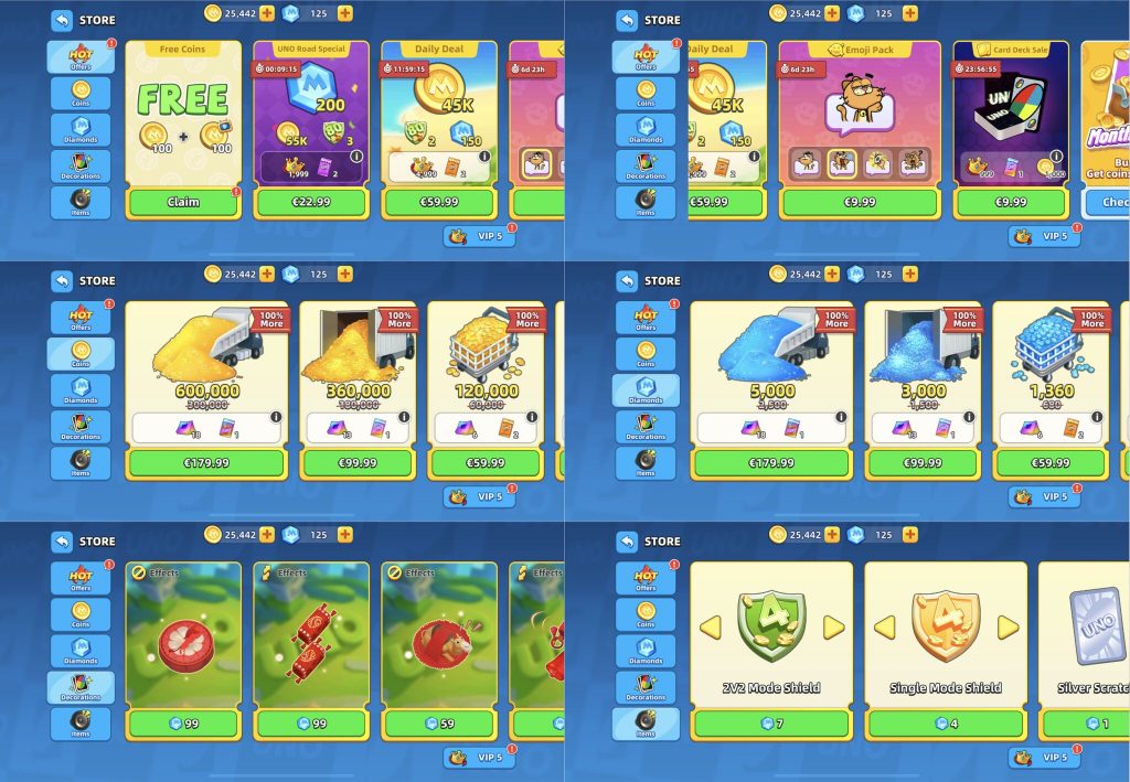
- Tabs and sections help organize an expansive inventory.
- Red bubbles smartly signal urgency and unclaimed items.
- Animated slot content adds perceived value.
- Tooltips for lootboxes, VIP status benefits, and first-purchase bonuses are all clearly explained.
- Large slot sizes for top items demand attention—and feel premium.
- Arrow-controlled slot expansion adds a UX innovation rarely seen elsewhere.
💡 A note from Michael:
“I’ve been playing for years, and I still find something new in this shop. That’s rare.”
What could be improved:
- Too much content on screen—some slots barely fit.
- No clear sorting logic for bundles.
- Visual noise can reduce clarity despite strong structure.
- Shop is simply called “Store”—a missed opportunity for branding.
Rummy Fun – GameDuell GmbH
Rummy Fun presents a clean, efficient store—one designed for clarity and trust over flash.
 Data about downloads and IAP revenue of Rummy Fun by GameDuell GmbH in AppMagic (July 2025). Note that the platform doesn’t provide ad revenue data.
What works:
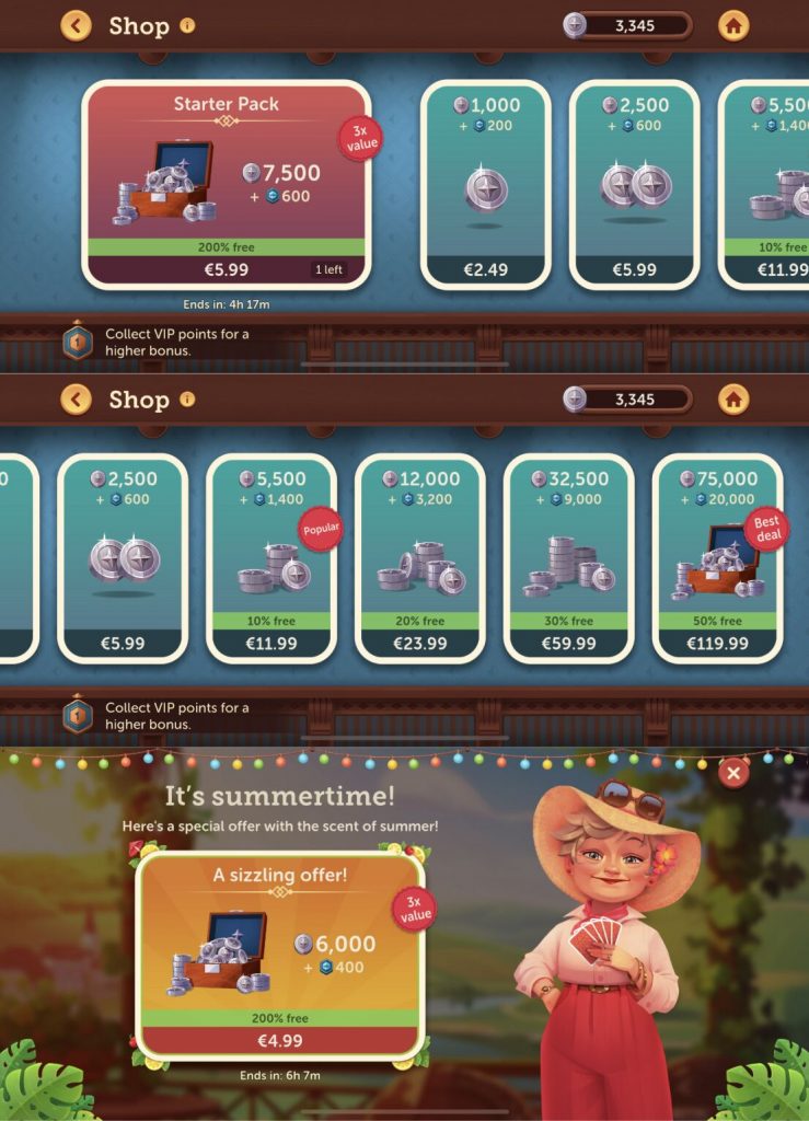
- Two clearly defined sections—offers and coin packs.
- Red badge markers highlight key deals.
- Time-limited offers and purchase caps are clearly stated.
- Linear pricing curve is easy to parse: $2.5 → $6 → $12 → $24 → $60 → $120.
- Value progression is explicit—10%, 20%, 30%, 50%—making up-selling more intuitive.
- VIP status is integrated, nudging players toward longer-term commitment.
💡 A note from Michael:
“They have a character named Kate who introduces the game. Why not call it ‘Kate’s Shop’? That would deepen player immersion immediately.”
What could be improved:
- No first-purchase bonus, which feels like a missed early conversion hook.
- VIP points aren’t shown in the top panel—an opportunity to nudge rank-ups.
- Shop is just called “Store”—again, missing a simple narrative touch.
Final Thoughts
There’s no single formula for a successful in-game shop—but there are patterns.
Great shops build trust with clarity. They guide spending without pushing. They match their monetization structure to their game’s pacing, player base, and emotional tone. And most importantly—they evolve.
At Balancy, we believe the smartest shops are the ones you can iterate on. That’s why we built tools that let teams manage dynamic store content, test value progression, segment offers, and adapt to real-time player behavior—without developer bottlenecks.
Bonus Material: The Shop Bible for F2P Teams
For a deeper dive, don’t miss our book:
𝗕𝗲𝘀𝘁 𝗣𝗿𝗮𝗰𝘁𝗶𝗰𝗲𝘀 𝗳𝗼𝗿 𝗜𝗻-𝗚𝗮𝗺𝗲 𝗦𝗵𝗼𝗽𝘀 by Michael Khripin — a go-to resource for LiveOps teams around the world.
Originally published by Balancy, the book has gone viral and has been featured by major industry media outlets.
🎥 Webinar Replay: From Good Shops to Great Systems
To expand on the book’s insights, we brought in:
𝗠𝗶𝗰𝗵𝗮ł 𝗞𝗼𝗿𝗲𝗸, Product Manager at Ten Square Games (Poland’s top-grossing studio) and former lead of Hunt Royale at BoomBit.
In this session, Michał joins Michael Khripin to explore how top-performing teams structure monetization systems that are scalable, testable, and built for retention.
