
Gin Rummy Stars by Beach Bum is a standout title in the card game genre, offering a polished gameplay experience, a robust LiveOps calendar, and consistent top-tier performance in app stores. With millions of downloads and a highly engaged player base, the game has clearly found its market fit.
But even the most well-designed games leave room for optimization – especially when it comes to long-term retention and how the game reacts to player behavior.
We asked Michael Khripin, Product Owner at Balancy, to take a closer look at the game and identify areas for potential improvement. His insights are below.
Quick App Snapshot (2025)
- 5M+ downloads on Android (Google Play)
- 306K+ reviews, 4.9★ rating on Google Play
- 57.2K ratings, 4.8★ rating on iOS
- Estimated revenue: $1M+ (AppMagic)
- Primary monetization: Ads + In-App Purchases (“No Ads” bundle)
- Top country by downloads: Indonesia (63%)
- Top country by revenue: United States (40%)
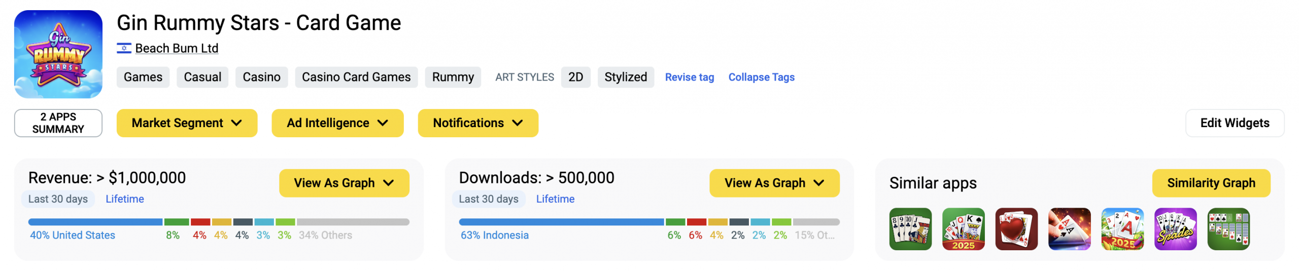
Data about downloads and IAP revenue of Gin Rummy Stars! in AppMagic (June, 2025). Note that the platform doesn’t provide ad revenue data.
The “No Ads” IAP: Effective, But Could Be Smarter Post-Purchase
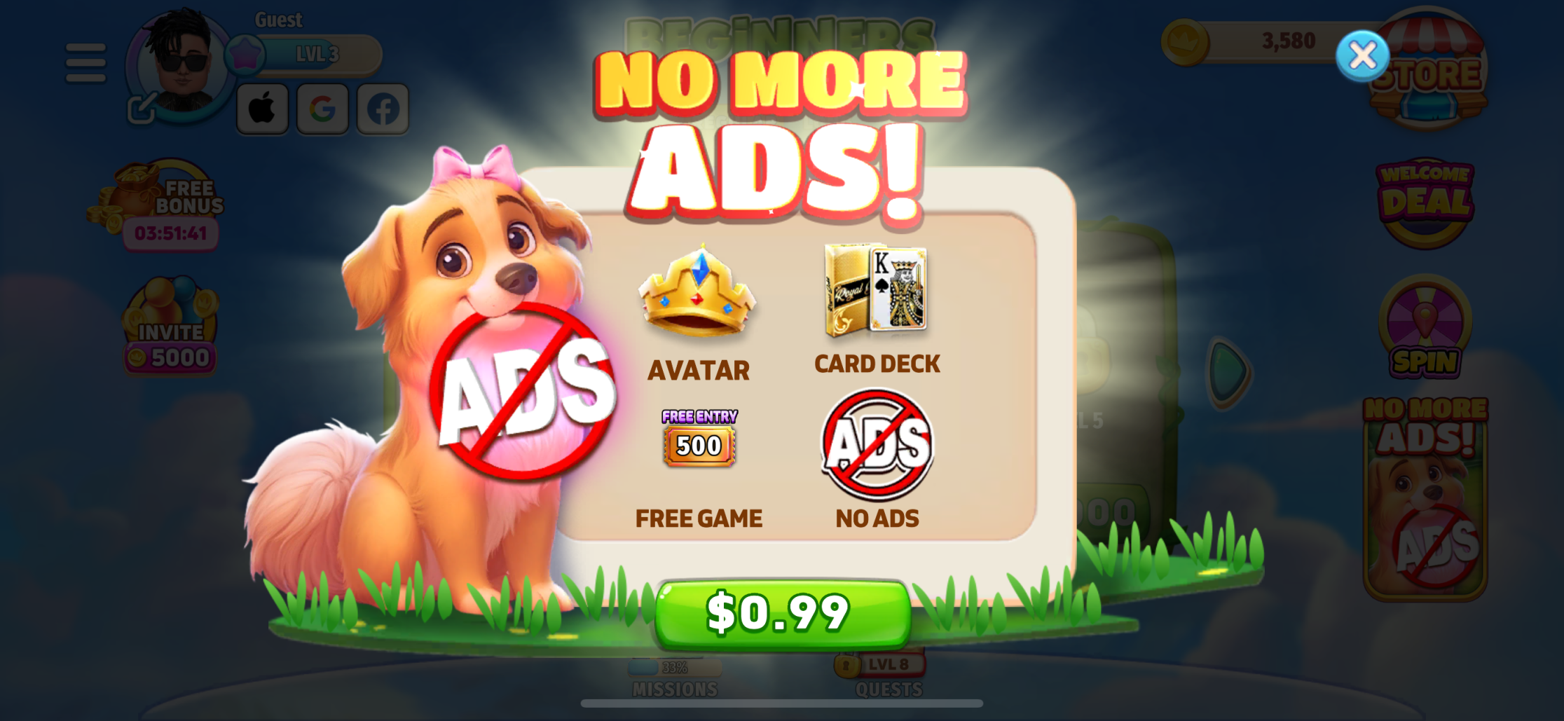
One of the game’s strongest early monetization levers is the “No Ads” bundle – a low-cost, clearly communicated offer that removes interruptions after a single purchase.
The value proposition is straightforward. The purchase flow is smooth. Ads are removed as promised.
But post-purchase, players still encounter the same “No Ads” banners and promotions across the UI.
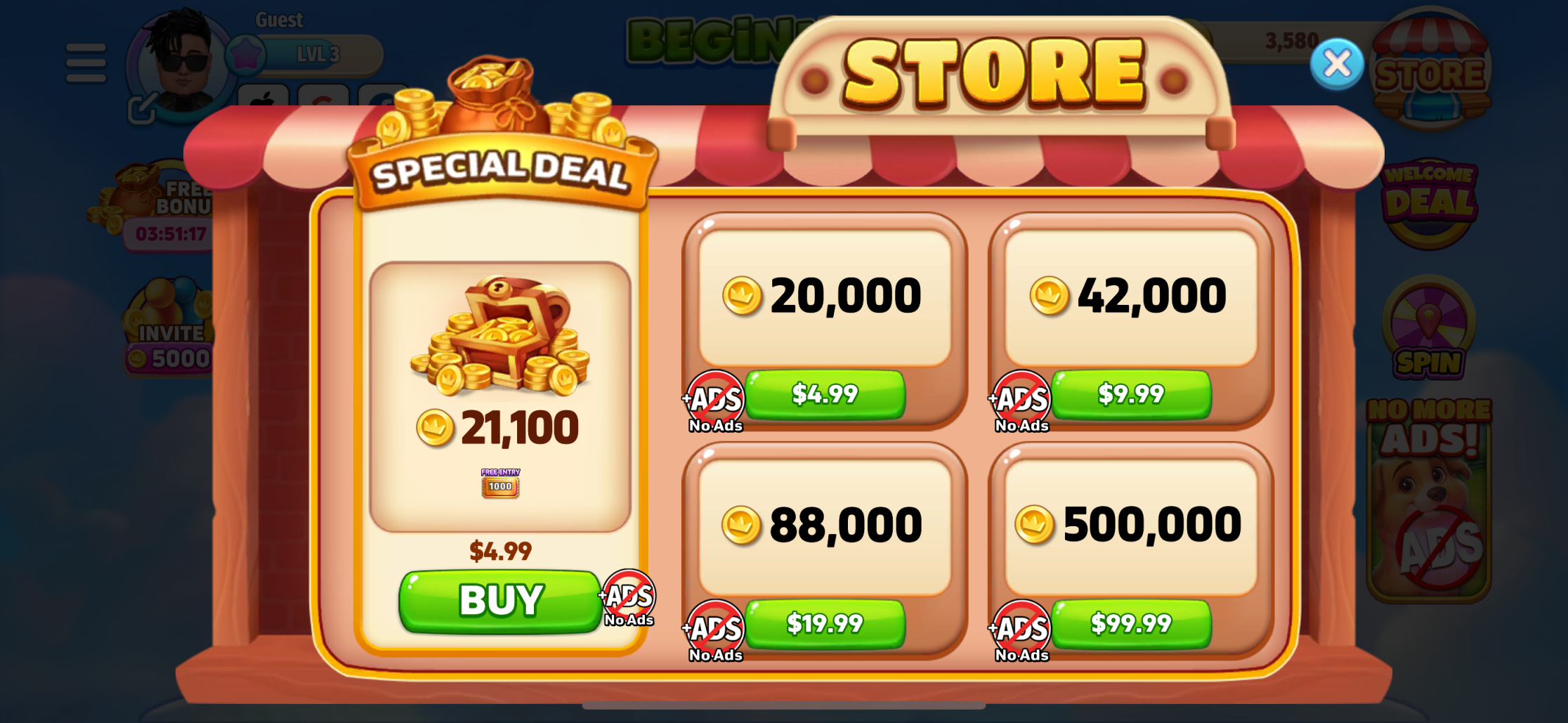
💡 A note from Michael: “This is a classic case of the UI not catching up to the player’s decision. The game delivered on its promise – but didn’t acknowledge it. And that subtle disconnect can add unnecessary friction.”
Design Insight:
Updating the interface to reflect purchase behavior – such as removing or replacing “No Ads” prompts – helps reinforce trust. These micro-adjustments don’t just tidy up the UI. They signal to the player that the game sees them.
Promo Popups: Informative, But Could Be Streamlined
Gin Rummy Stars runs multiple simultaneous events – tournaments, missions, seasonal offers, and reward tracks. Each one is introduced through its own popup at login.
This approach guarantees visibility. But the system repeats all the popups each time the player returns to the main screen – even if they’ve already dismissed them during that session.
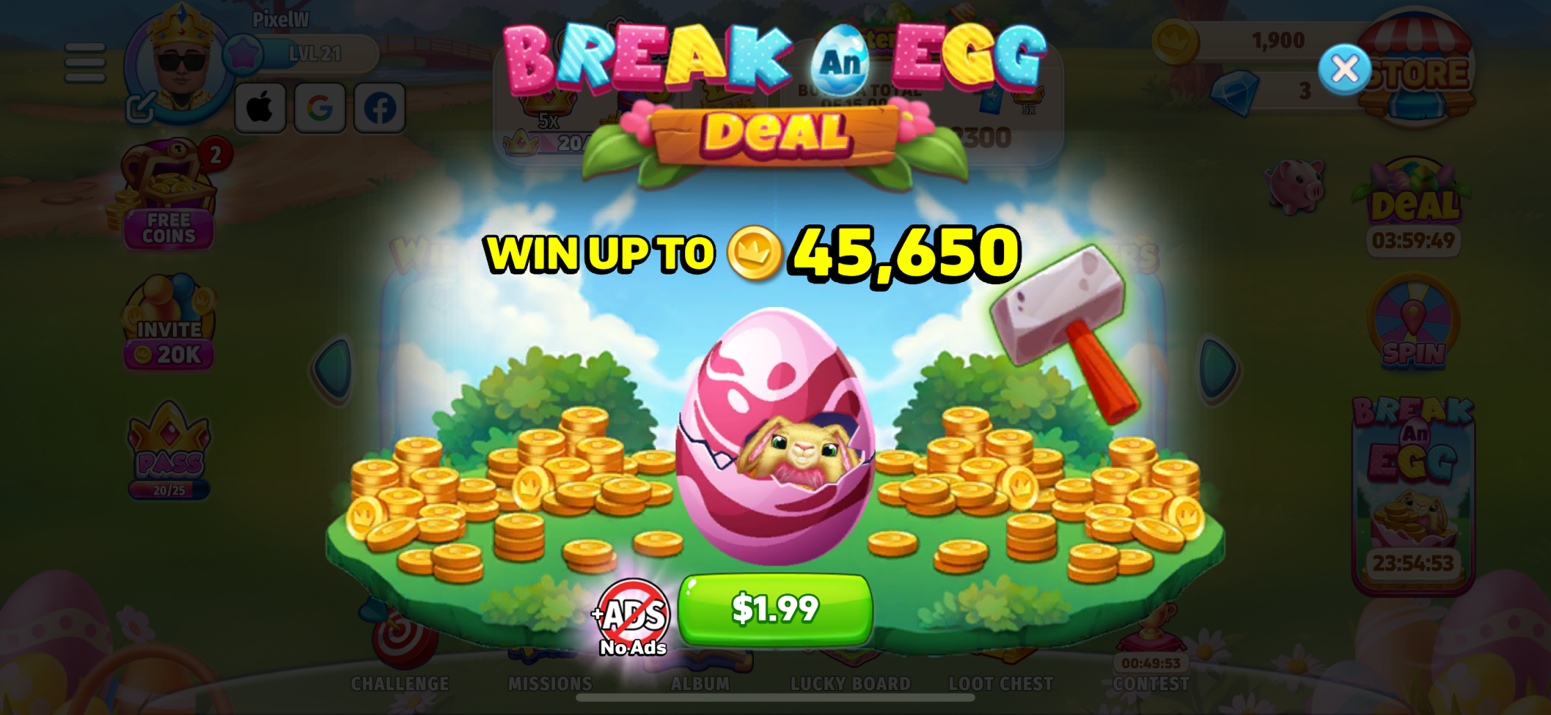
💡 A note from Michael: “It’s a visibility vs. memory tradeoff. The player sees everything… over and over again. At some point, the popups start to feel louder than the game itself.”
This pattern isn’t unique. Top games like Monopoly GO! also surface multiple offers per session. But many bundle them, stagger delivery, or use animations to soften the impact. In Gin Rummy Stars, the approach is more direct – and more persistent.
Design Insight:
Implementing a lightweight promo memory (e.g., “don’t show again this session”) or grouping events into a daily hub could maintain visibility while improving session flow.
UX Opportunity: From System-Driven to Player-Responsive
The backend systems behind Gin Rummy Stars are clearly working:
- The monetization strategy is coherent
- The LiveOps are well-paced
- The content is engaging
What’s missing isn’t functionality – it’s responsiveness.
When a game reflects a player’s actions – whether removing a redundant banner after a purchase or recognizing that a popup has been dismissed – it feels more intelligent. More respectful. More human.
And that feeling builds trust, which drives retention.
Takeaways for LiveOps Teams
- Tailor the UI Post-Purchase
Update visuals dynamically to reflect purchases (e.g., remove upsell prompts) - Track Promo Interactions
Avoid repeating popups that were dismissed during the same session - Bundle Events Intelligently
Surface multiple events through a single, clear entry point - Prioritize Clarity Over Quantity
Not every event needs a popup – focus on the most relevant to each player - Maintain Flexibility
Give players the ability to control or collapse event announcements
Final Thought
Gin Rummy Stars is a feature-rich, well-performing game with deep monetization logic and strong LiveOps execution.
A few subtle UX improvements – centered around acknowledgment, memory, and personalization – could elevate the experience even further and extend player lifecycles.
In a game that already delivers so much, how can design choices help it feel just a little more player-first?